Mojo Wellbeing: A no-nonsense brand for menopause
BRAND STRATEGY | VISUAL IDENTIY | NAMING | PACKAGING

Mojo Wellbeing set out to change how menopause is perceived and experienced. The category was dominated by clinical, euphemistic, and often alienating brands that made women feel like this natural stage of life was something to endure quietly. Mojo wanted to create a trustworthy, empowering space where women felt informed, supported, and proud without the stigma or sugar-coating.
The ambition was to position menopause not as a medical problem to fix, but as a moment of transformation and self-care, giving women tools and confidence to navigate it on their own terms.
-
Mojo Wellbeing was conceived to shift the narrative around menopause—a category often clinical, euphemistic, or alienating—into one of empowerment, clarity, and pride. Rather than treating menopause as a problem, Mojo redefines it as a powerful moment of transformation and self-care.Our strategic direction positioned Mojo as a straight-talking ally: bold, honest, and empathetic. The brand confronts menopause head-on, reassuring women that this natural stage of life is nothing to hide—and everything to own.
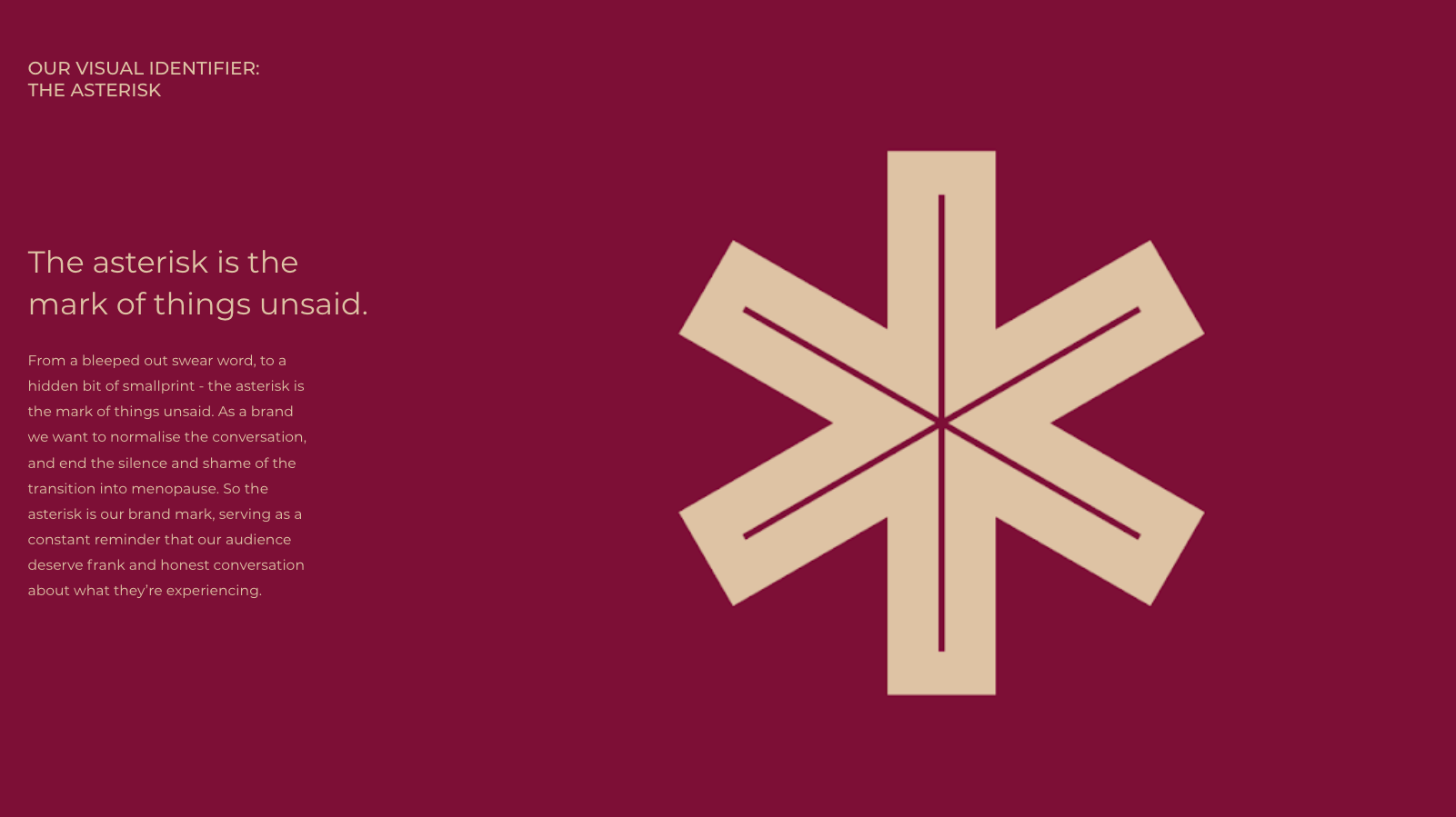
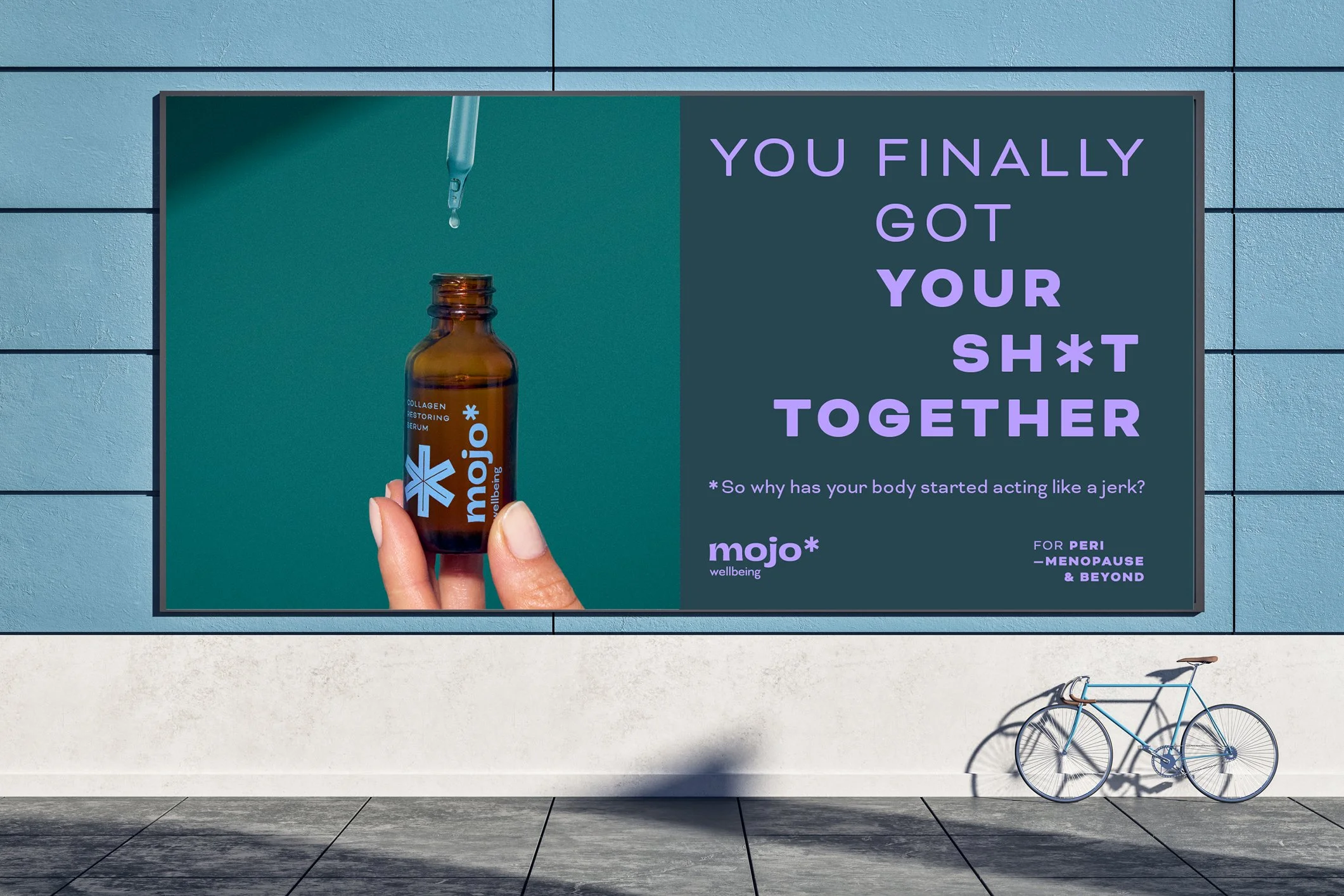
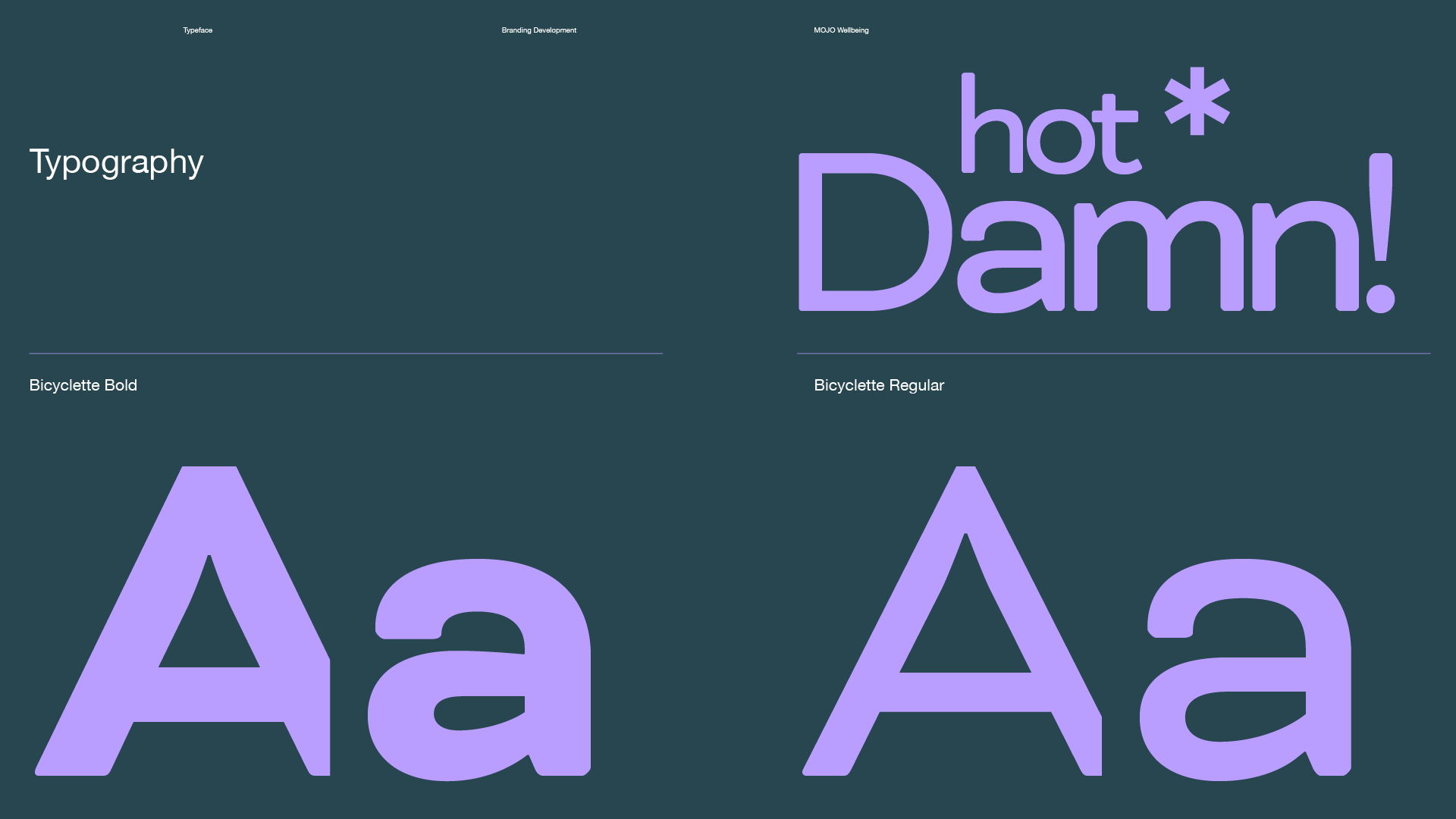
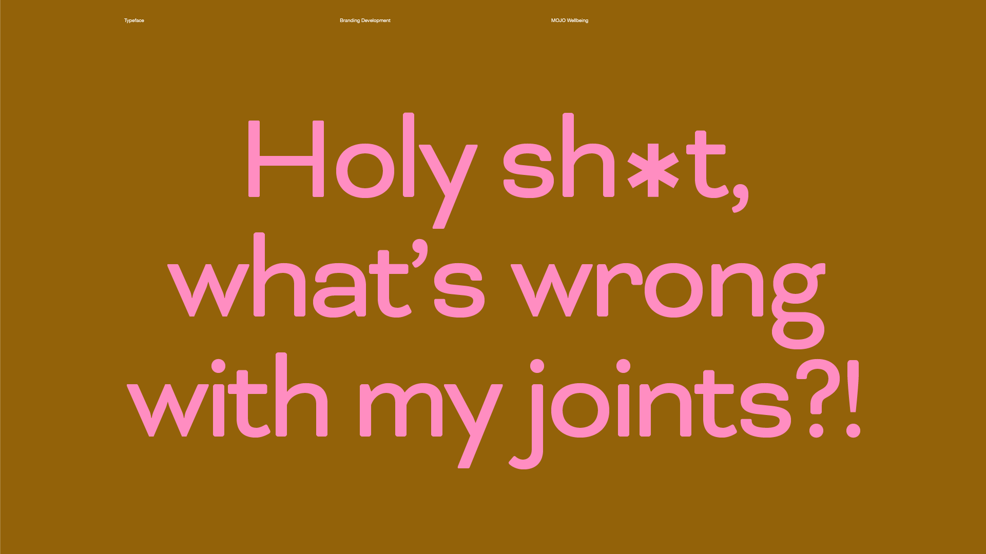
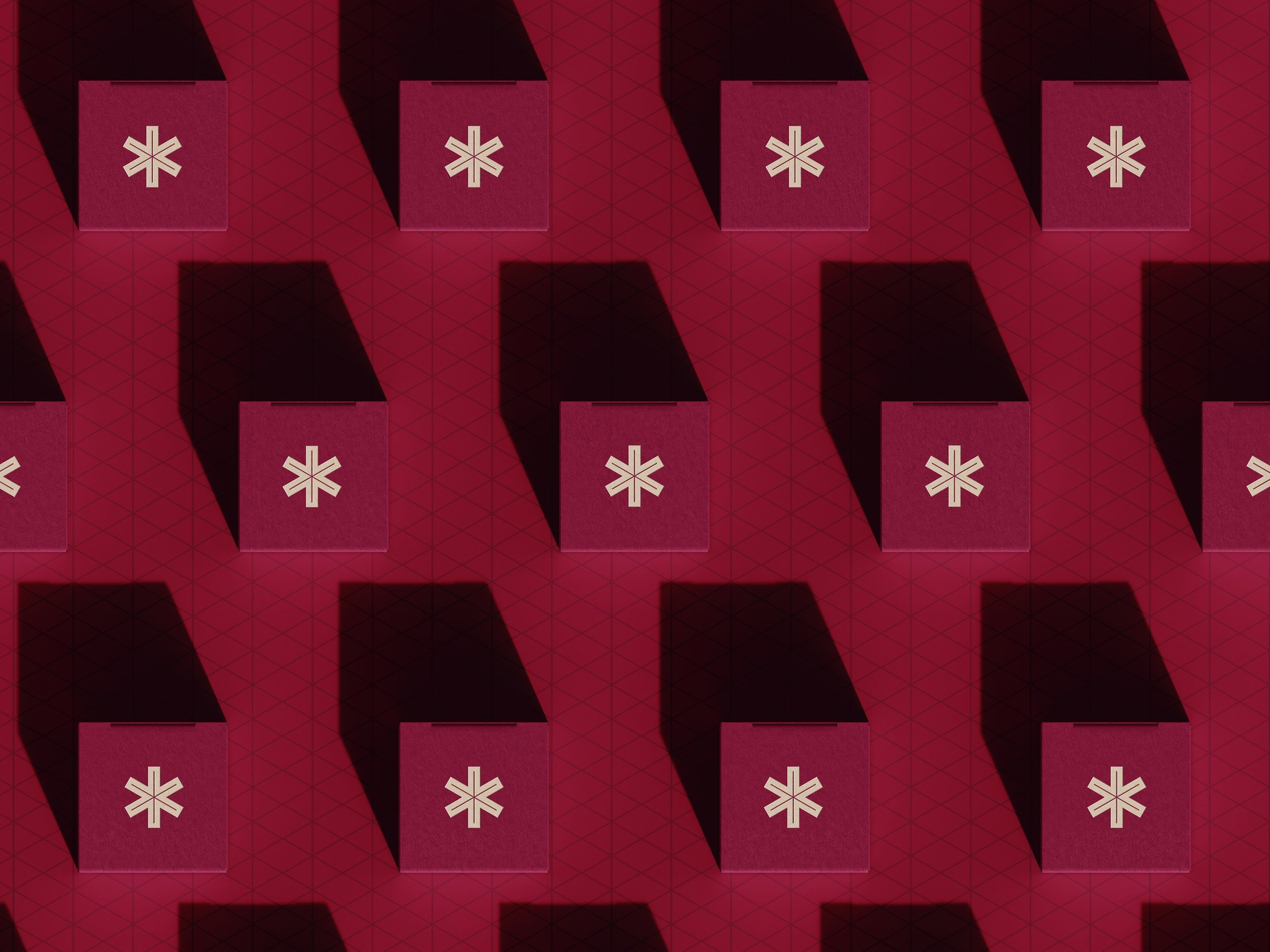
Central to the visual identity is the asterisk—simple yet potent, symbolizing transparency and clarity. It anchors the design language, which juxtaposes minimalist calm with bold graphic elements. Clean typography sits alongside an energized color palette that brings vibrancy to a space typically overly serious, blending credibility with approachability.
The identity spans packaging, campaigns, and digital touchpoints, shifting conversation around menopause from stigma to ownership. The result is a range that feels premium without being clinical, and a brand voice that builds trust through frankness, connection, and a dose of joy.
Client: Unilever | Agency: Anomaly London | Creative Direction: Camille Yin, Vix Jagger | Art Direction: Camille Yin | Design: Vicky Kochowski