We the Women: Shifting perceptions through collecive insight
BRAND STRATEGY | VISUAL IDENTITY | SOCIAL CAMPAIGN


We the Women set out to unite women’s perspectives from around the world and channel them into meaningful action toward the UN Sustainable Development Goals. Our challenge was to create a brand that felt trustworthy and inspiring, one that women everywhere could rally behind, reflecting their diversity and the power of their collective voice.
We needed to move beyond tokenistic or corporate language and instead build a brand that authentically celebrated women’s unique perspectives and made their contributions visible, valued, and impactful.
-
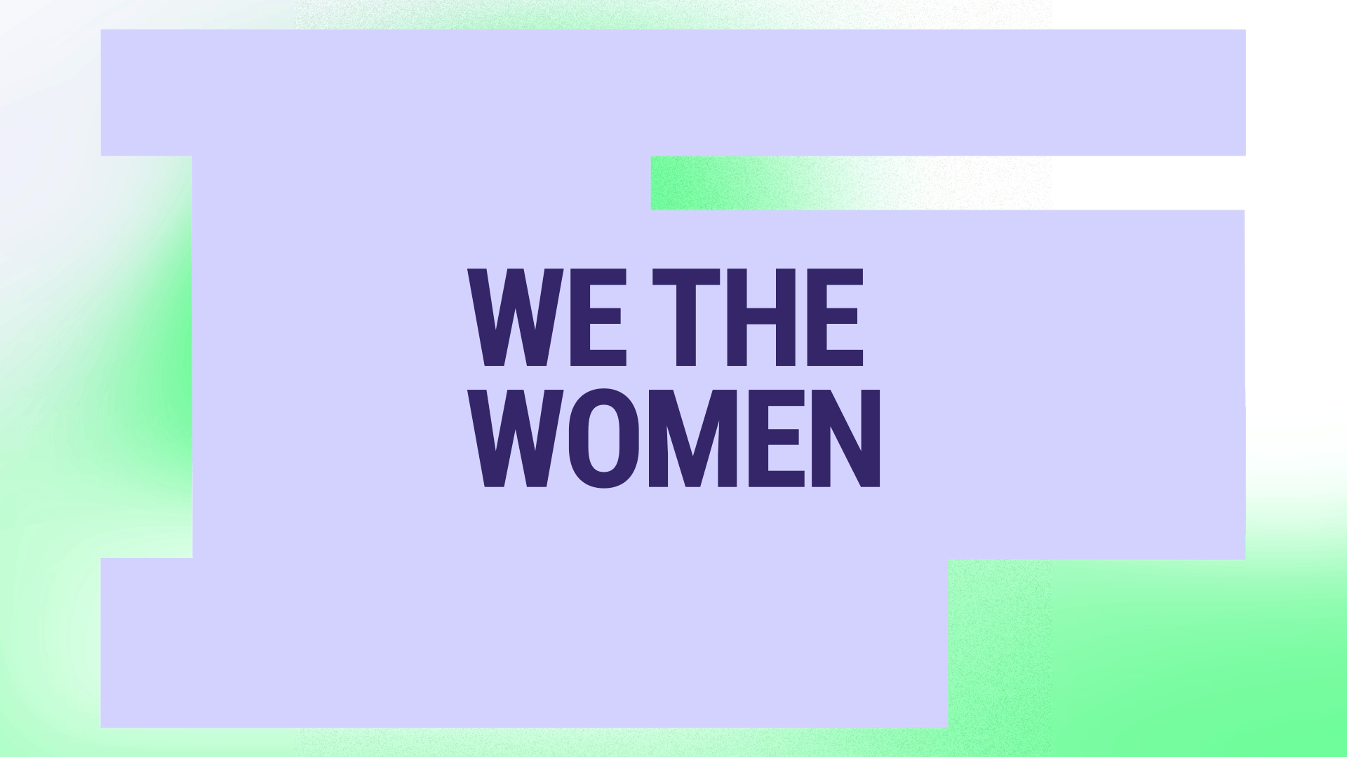
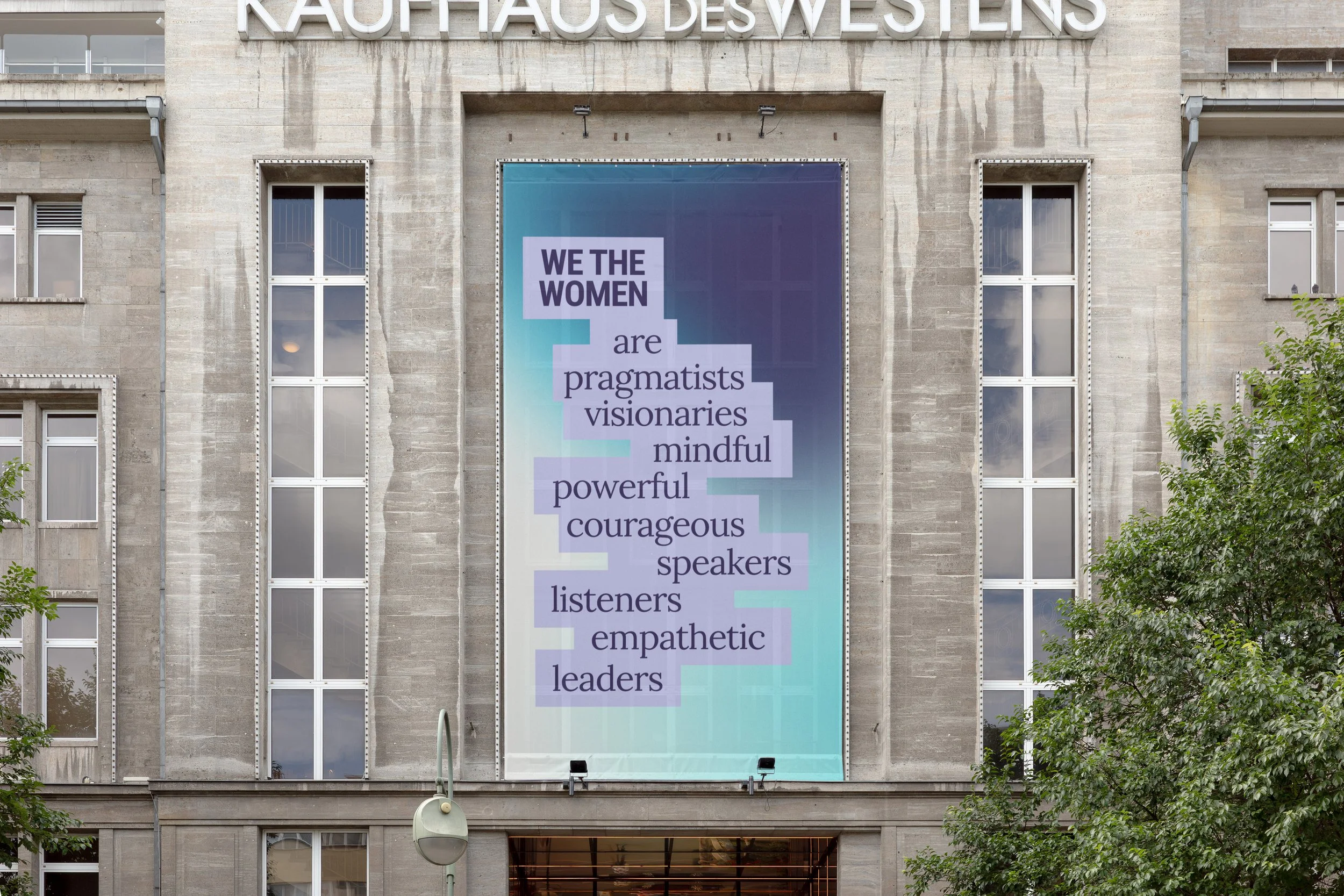
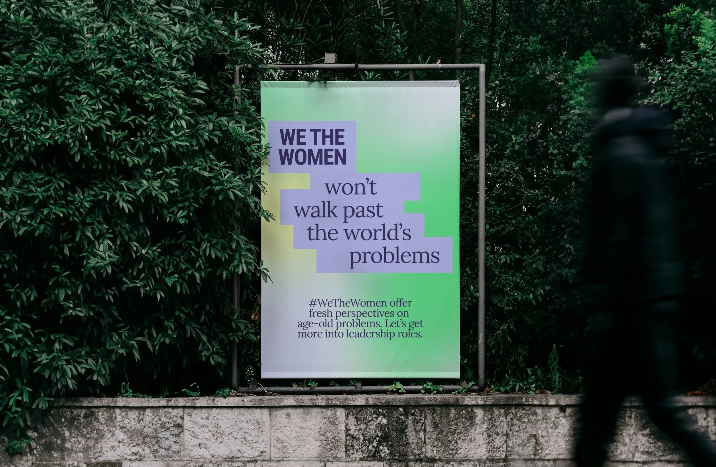
We the Women was created as a platform to bring women’s perspectives into the global conversation on the UN Sustainable Development Goals. The ambition wasn’t only to share voices, but to change how those voices are heard — to shift perception from women as participants to women as leaders of change.That idea of shifting perception became the creative foundation. Visually, it’s expressed through a living gradient: one colour evolving into another, symbolising viewpoints in motion. It shows how difference can coexist, overlap, and build into collective progress.
Typography and layout were designed to feel bold and uncompromising, giving language authority and space. The system flexes across social content, campaigns, and live moments — always framing women’s contributions as central, not secondary.
The result is an identity that doesn’t just carry stories, but actively reframes them. It makes visible the idea that women’s perspectives are not an addition to the conversation, but the lens through which meaningful change can happen.
Agency: Song London | Client: United Nations | Creative Direction: Camille Yin | Design: CJ Brown, Rosanna Gnocchi